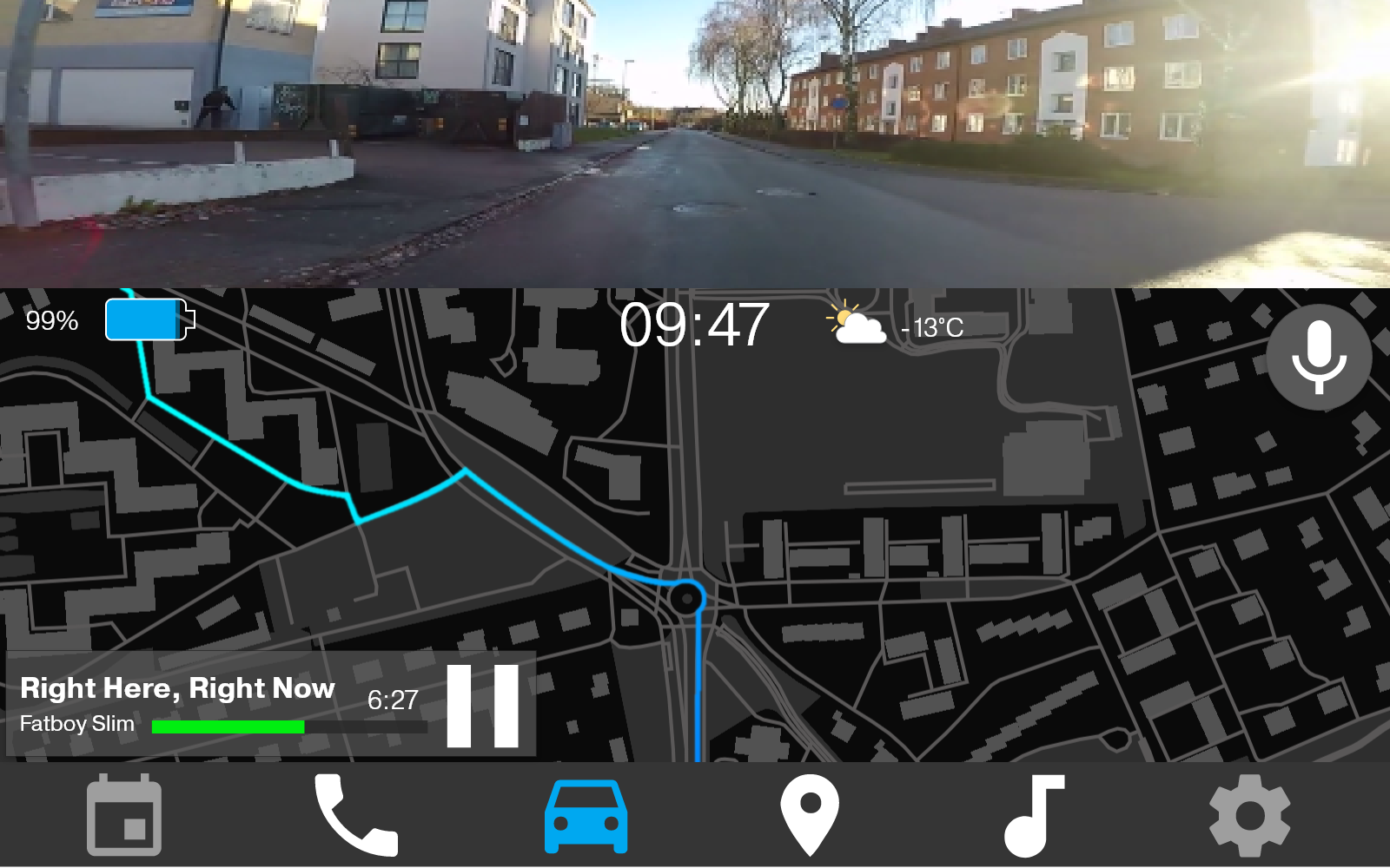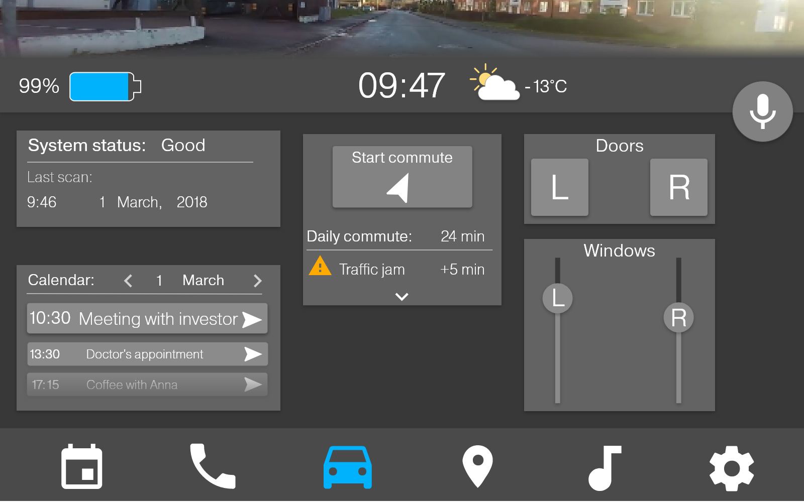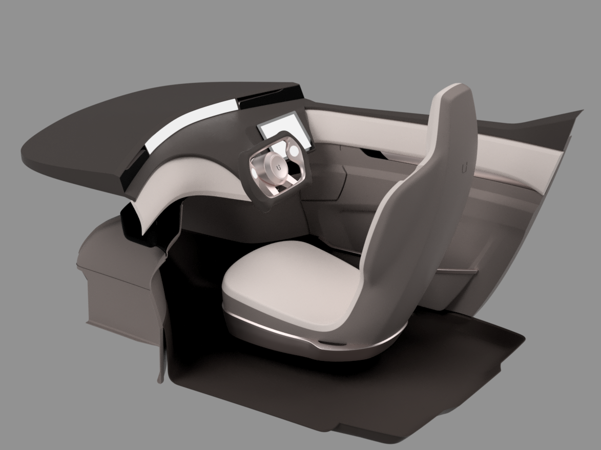

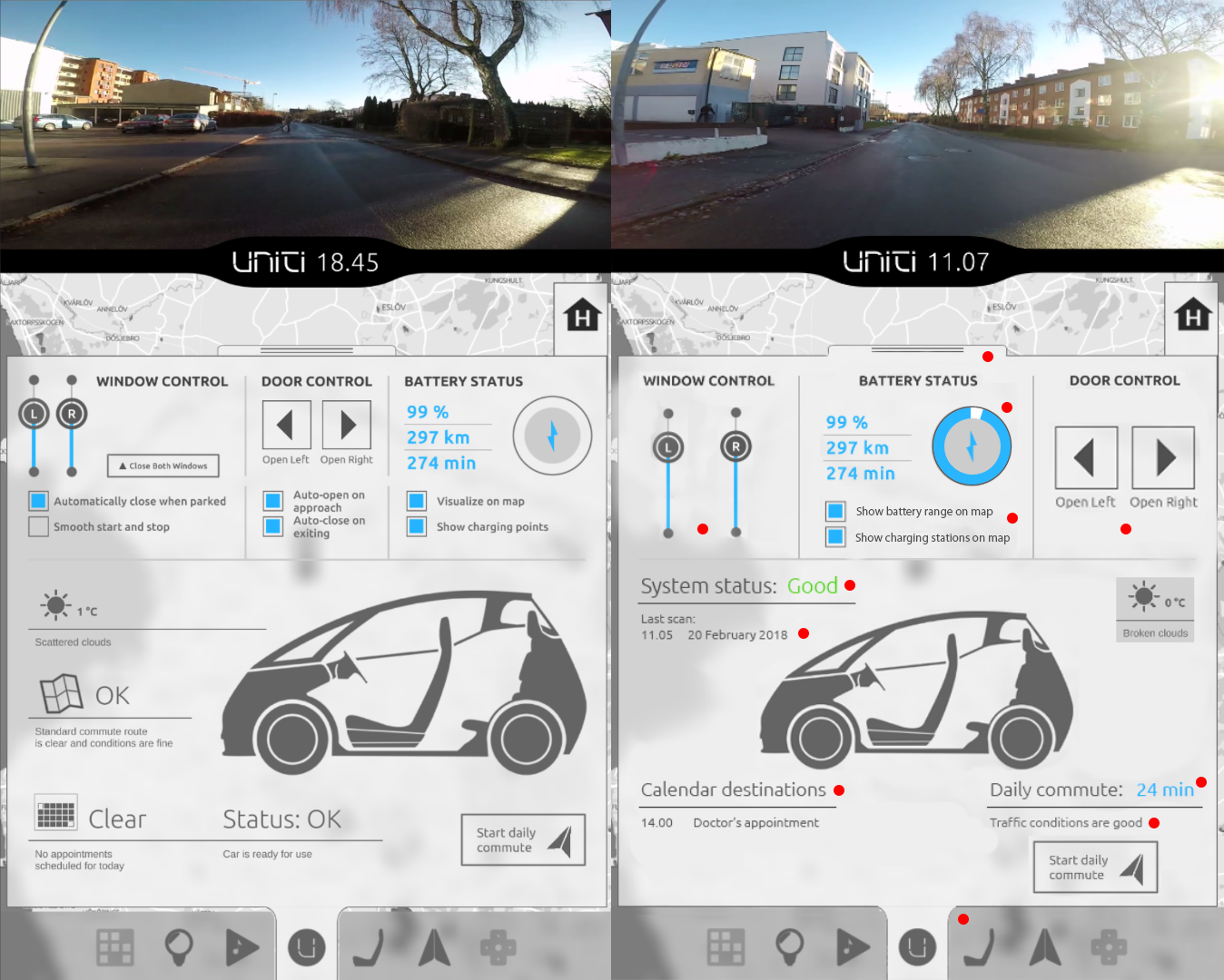
The image above shows one iteration step from November 2017 of the in-vehicle GUI that me and my team worked on for the Uniti One car. On the left you see the version that my team had done and on the right you see the version with the changes that I recommended.
I suggested moving some of the options for controlling the doors and windows to the settings menu, because they controlled preferences that I didn't think the user would have the need to change regularly. I also made the sliders and buttons larger for increased accuracy.
For the battery status section I simplified the language for showing the battery status and charging stations on the map. I also made the circle with the battery icon visualize the battery percentage.
I tried to clarify the "Status: OK"-section by specifying that it is the status of the car system and using words with a clear valence like "Good" as opposed to "OK" ("Is OK good or is it just OK?"). I also added information about the latest scan of the system so that the user can see that the system scan is showing updated information and is working properly.
I also changed the headline for the calendar because just "Clear" is too ambiguous and is subject to change if the calendar isn't clear. The user needs consistancy for efficient visual search and comprehension.
I moved the information about the traffic conditions for the daily commute to where the button to start the daily commute was. My reasoning behind it was that if the user wishes to press the button, it is likely that they would also be interested to know about the traffic conditions and vice versa. I also added information about the estimated time it will take to drive. The time it takes to travel somewhere is the relevant part of the mental model that the user uses to decide whether to take another route or call in late for work, not the traffic conditions per se.